I was in a pickle: I wanted to create an infographic but didn’t have Photoshop or Illustrator. Fortunately, a graphic designer friend of mine recently pointed me toward infogr.am: a free infographic creation site that – for better or worse – takes design out of the infographic equation and let’s you focus on data and copy. With infogr.am, you simply choose a template, then drag and drop different elements (text, images, graphs, etc.) onto your “canvas.”
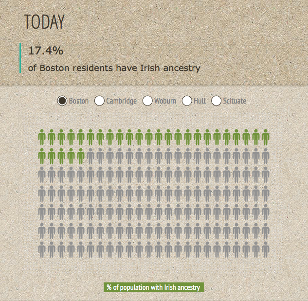
The coolest feature of the site has got to be its selection of interactive charts and graphs. For my “Boston Irish by the Numbers” infographic, I created an interactive chart that allows you to view the percentage of residents with Irish heritage in Boston and other communities in the Boston area. (Unfortunately, the screenshot below is static, so you can’t interact with it here!)
You can view the full “Boston Irish by the Numbers” infographic here.