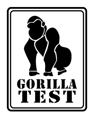
 As part of my ongoing efforts to learn the ins and outs of Adobe Illustrator, I recently took part in a logo design contest for a company called “Gorilla Test.” The prompt was simple: design a masculine-looking, easily recognizable gorilla that could serve as a mascot/icon for the business.
Needless to say, my logo designs didn’t get picked. But, then again, winning really wasn’t the point of this exercise. I’m just starting out in Illustrator, and the more fun little projects I can bang out on the weekends, the better I’ll get. (Or, at least that’s the plan).
For my fellow Illustrator rookies out there, never underestimate the power of tutorials. Here are 100: Get to it!
Now, onto the designs …
→ ♣ ←
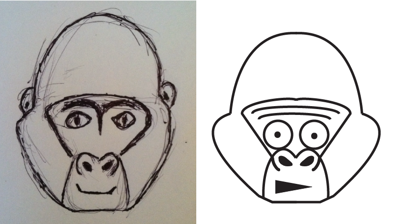
First, let’s have a laugh at my very first logo concept, which came out absolutely TERRIBLE. Somehow, I was able to take a crappy sketch and make an even crappier illustration.
→ ♣ ←
Taking heed of how ridiculously awful these first iterations were, I tried to tweak them a bit. The results (below) weren’t any better.
→ ♣ ←
But, as my parents always told me, “If your first gorillastration is shit, design a new gorilla.” So I did just that.
My sketch, as you can see below, was pretty crappy (especially in the face region). Fortunately, I had a great solution for that: don’t give the gorilla a face.

→ ♣ ←
I’ll now leave you with a few logo iterations based on the above gorillastration. While I didn’t fall in love with any of the end results, I did get a lot of practice creating custom shapes with the Pen Tool and messing around with different color palettes.
Leave me a comment if you have any tips, suggestions, criticisms, or grievances. And, until next time, happy illustrating.


