Hang around with a bunch of amazing graphic designers all day, and I promise you: you will eventually become envious of their seemingly magical skills.
And as talented as these folks are, even they point to other design work and say, “Holy crap, look how amazing that is! How did they do that?”
→ ♣ ←
This video was making the rounds among the design team a few weeks ago: It shows the painstaking process of hand-drawing a poster and then (and this is where the magic comes in) illustrating it on a computer, i.e. converting that drawing into a vector graphic and colorizing it.
 I was dumbfounded.
In order to illustrate the elephant/mammoth he had drawn, the artist had to create dozens upon dozens of custom shapes. These shapes made up the various segments of the elephant/mammoth’s body. He then filled those shapes with colors and gradients and applied textures and effects to produce the incredible, mosaic-like end result.
→ ♣ ←
Sooo I’m not that good. Not even close. As of the time of this writing, I’ve been messing around with Illustrator for approximately 2-3 weeks.
But you gotta start somewhere. So, here’s what I did …
→ ♣ ←
1. Learn How to Draw (Then, Draw Something)
I learned how to draw about 4 months ago, so I had this first step out of the way.
I mean, I could already draw before 4 months ago, but I had never actually learned how to draw up until that point.
 It’s funny: of all the useless crap that we’re forced to learn in school … how many of us ever got solid instruction on the basics of drawing?
Do yourself a favor: Read Drawing on the Right Side of the Brain, or better still, get the Drawing on the Right Side of the Brain workbook. You’ll soon understand that drawing is a learnable, teachable skill, and not something that only some people are born with.
More specifically, you’ll learn the basic component skills that make up the global skill of drawing, which are …
- Perceiving edges (where one thing ends and another beings)
- Perceiving spaces (what’s beside and beyond)
- Perceiving relationships (seeing in perspective and in proportion)
- Perceiving lights and shadows (seeing degrees of values)
- Perceiving gestalt (seeing the whole and its component parts)
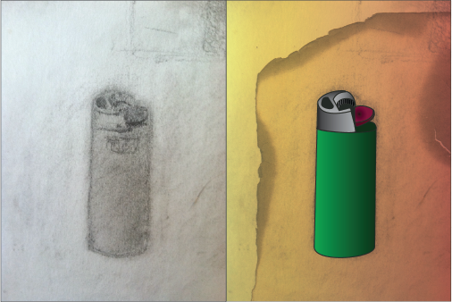
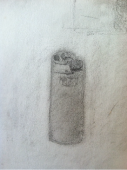
As you can see by my pretty “meh” drawing of a lighter above, I’m no pro. But hey, I’m-a-learnin’.
→ ♣ ←
2. Scan & Upload Your Drawing
I used a free iPhone app to scan my drawing (and then emailed it to myself). If you have access to an actual scanner, you’ll probably get better results.
Once you have your scanned drawing saved to your computer, open it in Illustrator.
→ ♣ ←
3. Learn How to Use the Pen Tool (Then, Use It)

This was the toughest part. At first glance, the Pen Tool seems easy: Just click, move, click and POW you have a straight line.
But what about curved lines? And how do you create shapes that have both straight and curved lines? And how do you make sure you’ll be able to fill the shape you’re creating with a color or gradient?
Great questions. The answers are here on the Adobe site. I recommend giving that stuff a read. Then, hop into Illustrator and start messing around.
For me, despite theoretically understanding the Pen Tool, I wasn’t really able to grasp how all of its functions worked until I had done a little trial and error work.
Once you’ve got the hang of it, start creating shapes over top of your drawing (you’re effectively tracing it). You’ll want a separate shape for each of your drawing’s components. That way, you can fill them individually with specific colors/gradients.
FYI: For my lighter illustration, I used a 2-pt. stroke weight, then filled in the vast majority of the resulting shapes with gradients in order to recreate the shading in my drawing.
→ ♣ ←
And that’s pretty much it.
When I was happy with the design of my lighter, I messed around with the background a bit. First, I added a yellow-to-orange gradient layer, and used the “multiply” opacity setting to have it really blend in with the paper from my scanned drawing. Then, I added a burnt paper texture over top of that, again using that “multiply” opacity setting.
It ain’t perfect, but it’s a start.
→ ♣ ←
If you have any Illustrator tips, tricks, insights, voodoo, etc. you want to share, definitely leave a message in the comments section below.
Happy illustrating.

Every weekend i used to pay a quick visit this site, because i wish for enjoyment, since this this site conations
really nice funny material too.
But as opposed to parents who get a tax credit to help raise their minor children, providers of family members elder care get no tax deduction or credit.
I always spent my half an hour to read this webpage’s articles
or reviews daily along with a cup of coffee.